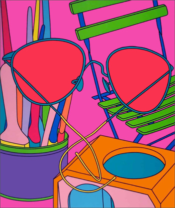
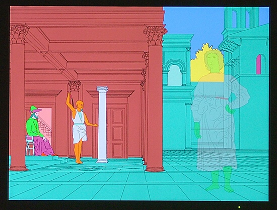
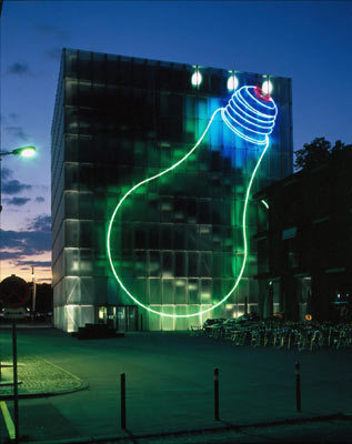
He is classed as an artist (uh oh that great art/design divide again...) but i think his work is very graphic design - its clean and sharp and I want it on my walls!
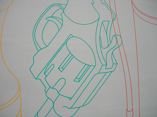
The drawing are similar or rather are a more basic version of a technical drawing, and the enlarging and overlapping of the objects helps 'hide' what it actually is at times, whilst still maintaining a very simple, clean imagery.
He often groups objects in an odd combination; his style is known as 'detached conceptualism, minimal construction by the artist and the use of readymade techniques.'
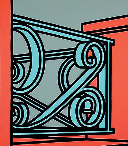
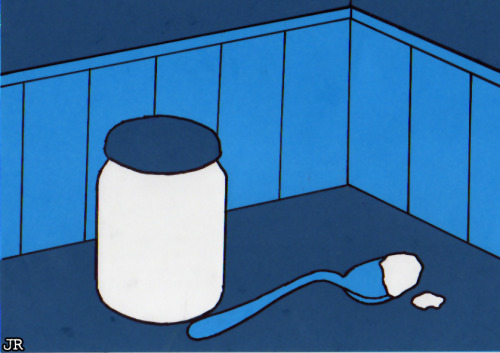
"Craig-Martin's later works have used a stylised drawing technique often depicting everyday household objects and sometimes incorporating art references, such as objects known from their use in Dada artworks. His work can be compared to that of his earlier contemporary Patrick Caulfield and latterly with that of Julian Opie. There is no differentiation in treatment, which consists of black line drawings with lines of equal mechanical width and brightly coloured images, which have been compared to "nursery" colours."
Patrick Caulfield






No comments:
Post a Comment