Found this...
Can you see anything else besides a mountain?
You must be thinking what is there to see as it clearly shows the Swiss Alps?
Toblerone originated in Bern, Switzerland – A city whose name is rumored to mean, 'City of Bears' . When you look at it again you will find a bear in the logo.
The same can be said for the FedEx logo:-
Can you see it? The arrow? No:-
It's so clever! Here is an interview with the designer of the logo. He talks about the creation of the logo
and how over 200 designs were created and reviewed. It was only until he started playing with the lower case 'x' and capital 'e' that he could see and arrow shape, even though at first abstract; so he discussed his processes in order to get the final image and refine the arrow shape.
There are loads of examples of these and I think they are amazingly clever!! The simplest idea with such a powerful effect! Here are some of my favourites...
This could be defined as real creativity…A regular film reel turned to look like a scary ghost for a production house.
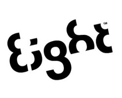
This is very cleverly designed with a typeface where every letter is a variation of number 8. Nothing better have been thought.
This famous logo is extremely clean and simple but this arrow might not look like more than a smile to you. Before, coming to any conclusions I would like you to know the concept behind this…it says that amazon.com has everything from a to z and it also represents the smile brought to the customer’s face.
The logo, at first glance, looks like a bunch of colored/transparent shapes on top of each other. But I bring this logo to make you realize that each shape is the shape of what London looked like once. The entire logo represents the evolution of the land of London through time.
Some more can be found here, there, and every where.


No comments:
Post a Comment